Category Archives: matrixes make me cry

Taking a Hatchet to Your Matrix

Not a newsflash: I hate matrixes. That being said, I acknowledge they’re sometimes going to be necessary. If you’ve got to use one, though, I think it’s in everyone’s interest to keep each one as small as possible, and to use as few of them as possible.

There’s often a point in web surveys where the respondent is asked whether or not he has heard of a number of different items – brands of orange juice, for instance, to use my favorite example. That’s followed by another question asking which of the brands the respondent has personally tried.

Then come the matrixes, where respondents are asked to rate each of the brands that they’ve heard of – not just the subset they’ve personally tried – across a number of rating criteria, each one likely being its own matrix on its own page. This is the point where the respondent suddenly regrets being so honest about the brands he’s seen in the grocery store or advertised on TV, because he suddenly realizes he’s going to be spending the next fifteen minutes of his life clicking “don’t know” or “not applicable” on matrix after matrix inquiring about the best flavor, the least pulp, the nicest packaging, and so on. I get, very clearly, that as researchers, this isn’t entirely a waste of time – we can give our clients a report that shows the attitudes crosstabbed by both active users and those who are just aware of each brand. It has the added “bonus” of letting us inflate the number of respondents — you get to tell your client that you asked the evaluation questions of significantly more people than you would have if you’d only included those who use the brands in question. (This is the product research version of asking unlikely voters how they’ll be voting.) And, of course, it’s possible that some respondents will have differing levels of familiarity with the products they don’t themselves use, and may actually be able to provide useful feedback nevertheless. But, still:

I’m writing this, actually, as I take a break from a piece of research I’m in the middle of taking. I think I’m on about the sixth matrix page. I’ve got 8 columns going across – 7 point Likert plus a “not sure” – and 10 rows of brands going down, only 1 of which is asking me about something I truly have knowledge of – the other 9 are things I’ve heard of, but have no ability to evaluate. I don’t want to go into specifics, but let’s pretend it’s about travel, and that it first asked me which foreign cities I’d ever considered traveling to, and then asked which ones I’d actually visited — and now it’s asking me about every city I’d considered going to, to rate the quality of its museums, central train station, hotels, safety, and so on. There might be the occasional question I can answer based on something a friend told me or based on something I vaguely remember reading on Wikipedia or in a Rough Guide, but in general, I’m just not able to comment on the friendliness of the Dublin populace, you know?

Not only is this frustrating, but I’m also (and this wouldn’t apply to an ordinary respondent) acutely aware that my speeding through page after page, clicking “not sure” for 9 of the 10 choices and then assigning an answer choice to the one thing I’m familiar with is probably going to result in my responses being discarded anyway.

I have a sense, based on the level of detail each matrix has gone into, that I’m going to have another 4 or 5 of these waiting for me, and honestly, I’m hoping I time out while I write this; if I do, I’m done.

Is an aggravated respondent really in anyone’s best interest?

4 Comments

Filed under bad user experiences, data quality, Market Research, matrixes make me cry, web research

Probability Sampling vs. Web Panel Sampling vs. Interviewing People Completely By Accident

A reader sent me this a number of months ago, and embarrassingly, I’m just getting around to posting it now, as I’ve been reminded by something @Lovestats posted the other day.

Another matrix with multiple problems — “I felt expected,” really? But the focus here actually isn’t the matrix, believe it or not: it’s that my reader has never actually stayed in the hotel that sent him the survey, with the familiar “please rate your recent stay with us at our such-and-such location” sort of email you tend to get after any interaction these days. Not only had he not stayed at that location — he’d never stayed at any hotel in the chain.

Now, I’m assuming this was a glitch of some sort — an actual customer with a similar email address had sloppy handwriting, or a friend of our reader has been giving out the reader’s information instead of his own, or the hotel company is a conglomerate and they actually meant to ask our reader to rate his experience buying a shirt at their clothing store  — but however it came about, it made me think — with all the ongoing discussion about probability samples versus non-probability samples, what about starting by just making sure you’re not interviewing people who are totally outside your frame?

2 Comments

Filed under Market Research, matrixes make me cry, web research, worrying about the wrong thing

CNET: At Least They Warn You It’s Going to be Horrible?

15-20 minutes? Even I probably won’t click to take this one.

Oh, all right, I did. Got about three minutes in (it’s about reward programs), hit my first matrix, and decided I wasn’t going any further:

Sorry, CNET, I’m out. Not only does this show every sign of making me miserable, it also doesn’t appear to have anything to do with your business, since I can’t imagine a product review site launching its own rewards program. If the research looked like it was directly connected to improving the site I actually was interested in viewing when I went to cnet.com this morning, I might have been willing to go further with this, but not for this.

Leave a comment

Filed under bad user experiences, Market Research, matrixes make me cry, web research

Just Say No Already.

Annie Pettit this morning tweeted from the Net Gain 4.0 Conference in Toronto:

Clients still want 1 hour surveys and we can’t do anything about it : I say turn it down!!

I’ll go further than that: I say turn it down and make it clear to the client that they are the cancer that is killing market research. What in the world can you learn from a sixty minute survey that you can’t learn from a 5-minute one? (I’m not talking about an in-depth qualitative research project, or something where you hook someone up to an EEG and have them watch an episode of CSI: Miami to see what their brain has to say. I’m talking about asking questions, on the phone or on a screen. 60 minutes is 55 minutes too long!

Do we really think the respondents still on the phone (or on the web) at the one-minute mark, the ten-minute mark, and the 60-minute mark are identical?

4 Comments

Filed under bad user experiences, data quality, Market Research, matrixes make me cry, The cancer that is killing market research, web research

Straightlining vs. Answering Your Stupid Question Honestly

OK, this is something I hadn’t thought of before.

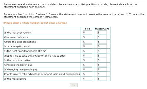
When I’m staring at a bad survey question — asking me to compare two absolutely identical companies in a matrix, for instance — my tendency is to do this:
straightline

They’re equal. There’s no difference between Visa and MasterCard in my mind. Discover and American Express, those are different, both from one another and from these two brands, but Visa and MasterCard might as well just merge, as far as I’m concerned. Of course, there’s no way to provide that answer in the framework provided here, so I decided to simply give each company a score of “5” for each item. That seemed to get the message across, as far as I was concerned. Of course, as soon as I clicked the button, I got booted, with the same generic non-qualified message you get when you tell them you don’t have kids or haven’t seen a movie in the past two months or whatever it is. We all know the truth: they booted me for straightlining.

Which I wasn’t.

At the very least, wouldn’t it be smarter to keep me in and see what the rest of my answers looked like? With the amount of amply-documented badly designed questionnaires out there, shouldn’t we maybe consider that a respondent will occasionally need to do something to get around a poorly framed question, or an item that simply doesn’t apply to them?

Simply ending the survey as soon as someone gives all items on a page the same value seems both too simplistic and too drastic a solution to me.

5 Comments

Filed under answer choices, bad user experiences, data quality, Greenfield, Market Research, matrixes make me cry, web research

Another Fine Matrix

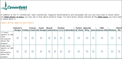
First, look at this full-size. See how there are 14 brands of cat food going across the top? I already told it I’d never heard of five of them, and yet here they all are again. It’s one thing to ask me if I’ve ever heard of a brand and to then, even if I haven’t, show me an ad for the brand and ask if I’ve seen that ad — I very well could have forgotten about it, or misremembered what brand it was for.

This is just stupid…

matrix from hell big

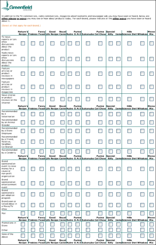
Worse, though, it’s endless. Here’s a reduced-size capture so you can see how long it is:

matrix from hell

This is what I’m referring to in the comments on Gary Langer’ post here — what the hell sort of non-representative person is going to sit through this? This kind of garbage really is the cancer that is killing market research. Stop pulling this crap, and then go and worry some more about probability samples.

3 Comments

Filed under bad user experiences, Greenfield, Market Research, matrixes make me cry, The cancer that is killing market research, web research

Zogby Motorcycle Emptiness

What fresh hell is this? John Zogby has discovered the matrix? And somehow made it uglier than any other matrix in the history of research? All true, and more on that in a moment, but first, this unusual use of the ticky box:

zogby motorcycles

That’s probably illegible unless you click on it, but the gist is I’m being asked, in a pretty wordy fashion at that, which of the following things I’m interested in or knowledgeable about; nothing inherently wrong with that setup, except this: I’m then given exactly one box to check (or not check, as the case may be) : “motorcycles.”

Let’s type it out and count, OK?

John’s Way: (53 words)

“Now for some questions about consumer goods categories. Please choose the categories in which you feel you have a particular interest and knowledge. This means you actively seek out information on these products and services (for example you watch TV shows/read magazines and websites/attend exhibitions/discuss with friends and colleagues etc.)

My Way: (6 words)

“How interested are you in motorcycles?”

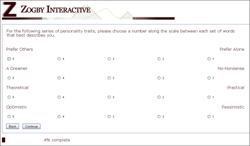
Now, it’s possible the reason I only saw the single checkbox for motorcycles is because my answers to the previous series of questions disqualified me from everything else, although I don’t really think my responses would have pointed in the direction of motorcycles,  but who am I to judge? Anyway, as promised, here’s what the first screen of these looked like:

zogby matrix

Maybe I shouldn’t say this is uglier than any other matrix — maybe it’s just that it’s simpler, in that it uses less newfangled HTML and is therefore, I don’t know, easier to access via mobile browsers, which isn’t a bad design goal to have — it’s just very strange looking to me, and pretty hard to take in at a glance. By the time you get down to the last button on the right, it’s not immediately obvious to me if that “1” radio button is for “Pessimistic” or for some other word that I perhaps need to scroll down for, or that’s just not appearing for some reason.

Are mobile/degraded browsers a big factor in the panel research industry? Are there a lot of folks on the Greenfield panel using Netscape 2.0 on Mac IIci’s or something? Because I seriously don’t get why this hasn’t all been replaced — and I’m talking about everyone here, not just Zogby — with some well-designed Flash code. Seems to me a freshman design student could pretty quickly mock up something vastly superior to anything being used in the industry today, no?

One other thing I found interesting: on some (but not all) screens of this survey, when I clicked the final radio button, I was automatically advanced to the next page. Despite the pages having a “continue” button on them, by the way. I don’t have a problem with auto-advancing in general, though I think it needs to either consistently happen 100% of the time or 0% of the time — but I’m curious what y’all think about it. Is the auto-advance, which would make it difficult or impossible to go back and fix an error you made, a good thing or a bad thing?

8 Comments

Filed under answer choices, bad user experiences, Market Research, matrixes make me cry, the web is a visual medium, web research, Zogby

Adblock? Never heard of it!

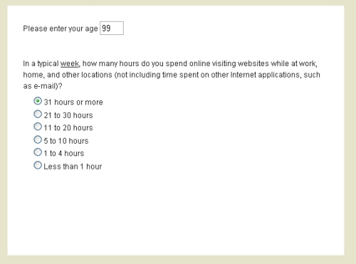
Here’s what I saw on the first screen of a survey Food and Wine magazine wanted me to take:

no button

(I entered my actual age for the question; I changed it to 99 for the screengrab.)

There’s no “continue” button here. I was initially hopeful that it was one of those speedy flash-based things that would zip me to the next question as soon as I clicked a radio button, but no, nothing happened.

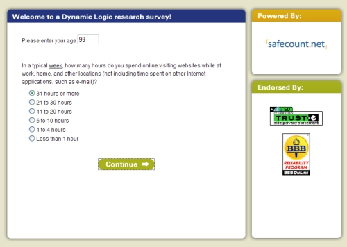
Temporarily disabling Adblock Plus– a Firefox extension that 8 million people used yesterday — makes the page (and its missing button) render properly, as does viewing it in Internet Explorer:

buttons

How is it possible that your testing didn’t catch this? How is it possible that you’ve managed to create the only survey I’ve ever seen that can be defeated by the most common advertisement blocking software on the planet? What vacuum are you working in where none of your staff is sophisticated enough to use Adblock?

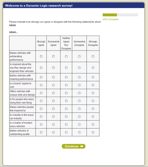
About six clicks later, after a few questions about three different car brands, I hit a matrix, asking about one of the three brands. Surprisingly, I only got asked the (horribly redundant) questions about this one brand, which was refreshing:

and heres the matrix

Meh.

Leave a comment

Filed under bad user experiences, Market Research, matrixes make me cry, redundant questions, web research

Is it me?

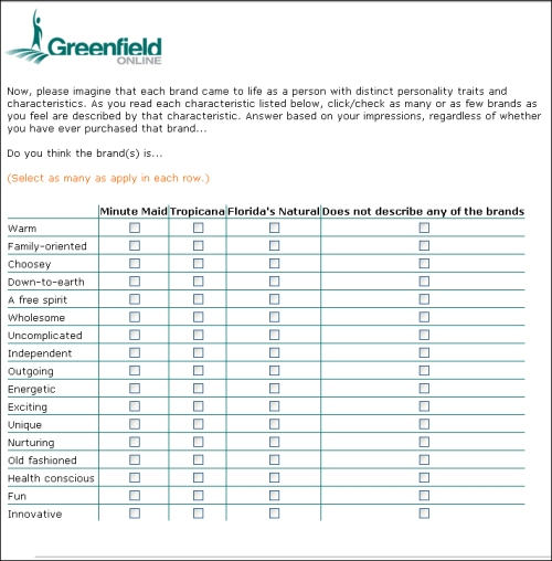
Is it just me, or do orange juice brand managers seem more likely than just about anyone else to think their brands have the ability to come to life with distinct human personality traits and characteristics? Is it just one crazy person who keeps using Greenfield for this? Is it the whole industry? Someone help me understand this.

This is at least the third time I’ve seen one of these:

another juice grid

(Also, “warm?” You really want me to think about whether or not any of these refrigerated products could best be described as being “warm?” Because, ew.)

ETA:

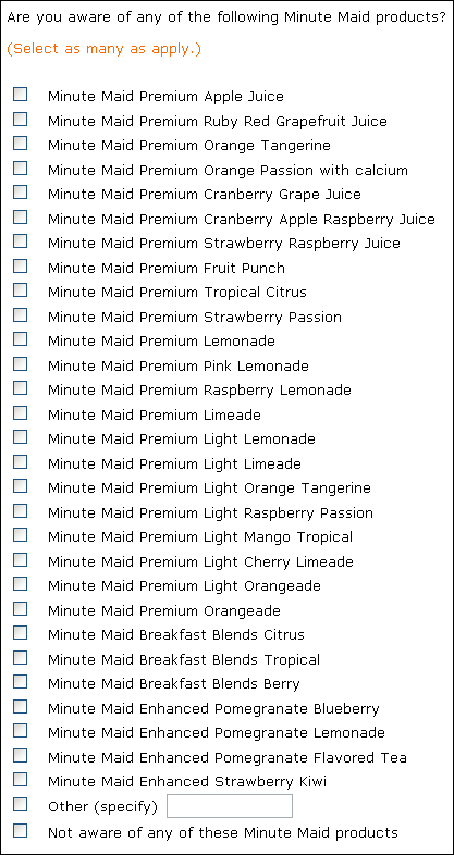
OH, COME ON. This is just ridiculous. I’m almost too fatigued looking at this to copy and paste it here, let alone fill it out. In fact, I think the only reason I’m continuing at all is so I can see what fresh horror awaits. How do they expect real people to answer things like this? Oh, right — because they promise us a sweepstakes entry in exchange for 35 minutes of our time. (No, really, they do:)

35 mins

Anyway, here’s what I’m yelling about now:

minute maid COME ON

6 Comments

Filed under answer choices, bad user experiences, Greenfield, incentives/compensation, Market Research, matrixes make me cry, web research

Whoa, Two Months?

Crap, I know I’ve been busy, but this is ridiculous.

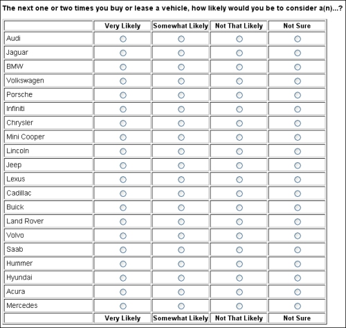
Still fighting the good fight, but haven’t had time to write about (or even look at) much research lately. I did catch this grid a couple days ago, and I think it’s worth throwing up and looking at, not because it’s a particularly terrible example (it’s sadly just typical), but because I can imagine so many better ways to measure this:

harris vehicle grid

Can’t you picture something with different carmaker logos (or, maybe even better, images of their most popular models) that you can drag up and down or left and right to indicate exactly how likely you would be to consider each of them? And that’s just my very first thought on this one.

Flash makes pretty much anything possible, but we’re still using virtual #2 pencils to fill in virtual scantron bubbles, aren’t we? What do you think?

8 Comments

Filed under Harris, Market Research, matrixes make me cry, open questions, the web is a visual medium, web research