Category Archives: bad user experiences

Yet Another Example of How Not To Use The Internet To Conduct Research

(edit, April 6, 2011: Over a year since I posted this, and I just took another Zogby poll (now an “Ibope Zogby poll,” by the way), and they’re still asking this question the same way. And I still, despite being pretty politically aware, knowing my congressman’s name, and having even written the guy and gotten a response on at least one occasion, have absolutely no idea what district number I live in. Everything below this parenthetical addition is old content, so if you have seen it before, sorry.)

This is from a couple of weeks ago, and I’m just now getting a chance to post it.

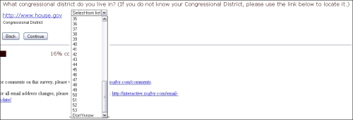
88% of Americans live in a state with fewer than 53 US congressional districts in it. Only California has that many; Texas comes in second with 32.

And yet, here’s how the good folks at Zogby Interactive ask what congressional district you live in:

That’s right. Zogby asks what state you live in, and then asks you, regardless of how many districts your state contains, which of 53 districts you live in. This is terrible for a lot of reasons, beginning with what should be obvious to everyone: it’s really lazy.

Looking at this from a practical political standpoint, though, it’s a mess. Folks just don’t think about their congressional district that way. Many (certainly not all) will know the name of their representative — or at least be able to pick the name from a short list of possibilities — but the odds of them knowing the actual district number aren’t great.

That being said: it can be problematic to ask people who their representative is if you’re then going to ask them if they’re going to vote for that person — it creates a priming effect and reminds (or informs, if the respondent is less focused on politics) of incumbency and makes it difficult to do a clean “would you vote for x or y” question. While I didn’t get that question as a follow-up, it’s possible some respondents did, though I somewhat doubt it this far out.

A much better way to ask this question is to ask for zip code, which will let you look up the right district in most cases; a simpler method (for the respondent), and one that might feel less personally intrusive, is to remember that this is the internet and present a state map, on which the respondent can zoom in and actually CLICK WHERE HE LIVES.

And, saying what should be obvious, but maybe isn’t: if you structure your research in such a way that only the very very very top-most super-engaged respondents are qualified to answer a follow-up, your results are only going to reflect that tiny slice of the population.

Pathetic, and sadly, about what one would expect.

Leave a comment

Filed under abject stupidity, bad user experiences, databases are your friend, election polling, Market Research, Politics, quality of responses, the web is a visual medium, Zogby

Taking a Hatchet to Your Matrix

Not a newsflash: I hate matrixes. That being said, I acknowledge they’re sometimes going to be necessary. If you’ve got to use one, though, I think it’s in everyone’s interest to keep each one as small as possible, and to use as few of them as possible.

There’s often a point in web surveys where the respondent is asked whether or not he has heard of a number of different items – brands of orange juice, for instance, to use my favorite example. That’s followed by another question asking which of the brands the respondent has personally tried.

Then come the matrixes, where respondents are asked to rate each of the brands that they’ve heard of – not just the subset they’ve personally tried – across a number of rating criteria, each one likely being its own matrix on its own page. This is the point where the respondent suddenly regrets being so honest about the brands he’s seen in the grocery store or advertised on TV, because he suddenly realizes he’s going to be spending the next fifteen minutes of his life clicking “don’t know” or “not applicable” on matrix after matrix inquiring about the best flavor, the least pulp, the nicest packaging, and so on. I get, very clearly, that as researchers, this isn’t entirely a waste of time – we can give our clients a report that shows the attitudes crosstabbed by both active users and those who are just aware of each brand. It has the added “bonus” of letting us inflate the number of respondents — you get to tell your client that you asked the evaluation questions of significantly more people than you would have if you’d only included those who use the brands in question. (This is the product research version of asking unlikely voters how they’ll be voting.) And, of course, it’s possible that some respondents will have differing levels of familiarity with the products they don’t themselves use, and may actually be able to provide useful feedback nevertheless. But, still:

I’m writing this, actually, as I take a break from a piece of research I’m in the middle of taking. I think I’m on about the sixth matrix page. I’ve got 8 columns going across – 7 point Likert plus a “not sure” – and 10 rows of brands going down, only 1 of which is asking me about something I truly have knowledge of – the other 9 are things I’ve heard of, but have no ability to evaluate. I don’t want to go into specifics, but let’s pretend it’s about travel, and that it first asked me which foreign cities I’d ever considered traveling to, and then asked which ones I’d actually visited — and now it’s asking me about every city I’d considered going to, to rate the quality of its museums, central train station, hotels, safety, and so on. There might be the occasional question I can answer based on something a friend told me or based on something I vaguely remember reading on Wikipedia or in a Rough Guide, but in general, I’m just not able to comment on the friendliness of the Dublin populace, you know?

Not only is this frustrating, but I’m also (and this wouldn’t apply to an ordinary respondent) acutely aware that my speeding through page after page, clicking “not sure” for 9 of the 10 choices and then assigning an answer choice to the one thing I’m familiar with is probably going to result in my responses being discarded anyway.

I have a sense, based on the level of detail each matrix has gone into, that I’m going to have another 4 or 5 of these waiting for me, and honestly, I’m hoping I time out while I write this; if I do, I’m done.

Is an aggravated respondent really in anyone’s best interest?

4 Comments

Filed under bad user experiences, data quality, Market Research, matrixes make me cry, web research

Obscure AND Potentially Personally Identifying? Let’s Ask It!

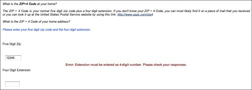
Sent in by a reader; click to embiggen:

Bad enough they’re asking for something few people would know offhand — and who wants to go fetch a piece of mail to get the answer  — but I think there’s an equally bad issue here regarding respondent confidentiality, at least theoretically.  A quick search of census data for some five-digit zip codes chosen at random from among those I’m familiar with around the country shows between about 8,500 and 16,000 occupied households in each. (I wouldn’t call that an average, as it’s practically anecdotal, but it’ll do for now, since I can’t find exactly what I’m looking for.)  A zip+4, though, is designed to be reflective of a much, much smaller geography. According to the US Postal Service:

The 4-digit add-on number identifies a geographic segment within the 5-digit delivery area, such as a city block, office building, individual high-volume receiver of mail, or any other unit that would aid efficient mail sorting and delivery

How small are those “geographic segments?” You can use this USPS lookup tool to get a sense of it. I live on a suburban street; my house is on a corner. My immediate neighbor around the corner has a different zip+4; the people across the street have a different zip+4; the house immediately behind me has a different zip +4. The house next door to me, though, and the two houses that follow it going down to the end of the block — those all have the same zip+4 data. Apparently, my personal zip+4 will narrow you down to one of four homes.

Now, presumably, you gave your full mailing address when you signed up for this panel, so it’s not as if the research company) doesn’t already know exactly who you are and where you live — and it’s not as if telephone research doesn’t contain your even more personally identifiable phone number right there in the data — but still, this makes me uncomfortable. Rather than using back-end databases to append that information in post-production (which, for the millionth time, would be the ideal way to deal with this situation), we’re instead outright asking for something that both makes your data pretty easy to tie back to you and which you don’t know in the first place. (I actually thought I knew mine, and I don’t, though I was fairly close.)

All in all, this strikes me as a really bad question. What do you think?

3 Comments

Filed under bad user experiences, data quality, databases are your friend, ethics, Market Research, redundant questions, web research

LA Times: What the What?

So for a couple of weeks now, I’ve been getting emails from the Los Angeles Times about how my email newsletter subscriptions are about to end. I’ve been ignoring them, because I don’t think I actually get any emails from the Los Angeles Times. I suppose I must have registered with a real email address on their site to read a story once, years ago, before BugMeNot and their Firefox extension made such things unnecessary. In any case, I don’t care, fine, whatever, stop sending me those newsletters you’re not actually sending me, I’ll find a way to survive, despite the longing I shall forever feel in my heart.

Just now, though, I got this brilliant piece of email from them:

“Why have we stopped sending you emails?” WHAT DO YOU THINK THIS THING IS? IT’S AN EMAIL! THAT YOU’RE SENDING ME! ABOUT HOW YOU’VE STOPPED SENDING ME EMAILS WHICH IN ACTUALITY YOU NEVER WERE SENDING ME IN THE FIRST PLACE!”

It boggles the mind.

Leave a comment

Filed under abject stupidity, bad user experiences, non-research, silly nitpicking, what

CNET: At Least They Warn You It’s Going to be Horrible?

15-20 minutes? Even I probably won’t click to take this one.

Oh, all right, I did. Got about three minutes in (it’s about reward programs), hit my first matrix, and decided I wasn’t going any further:

Sorry, CNET, I’m out. Not only does this show every sign of making me miserable, it also doesn’t appear to have anything to do with your business, since I can’t imagine a product review site launching its own rewards program. If the research looked like it was directly connected to improving the site I actually was interested in viewing when I went to cnet.com this morning, I might have been willing to go further with this, but not for this.

Leave a comment

Filed under bad user experiences, Market Research, matrixes make me cry, web research

Just Say No Already.

Annie Pettit this morning tweeted from the Net Gain 4.0 Conference in Toronto:

Clients still want 1 hour surveys and we can’t do anything about it : I say turn it down!!

I’ll go further than that: I say turn it down and make it clear to the client that they are the cancer that is killing market research. What in the world can you learn from a sixty minute survey that you can’t learn from a 5-minute one? (I’m not talking about an in-depth qualitative research project, or something where you hook someone up to an EEG and have them watch an episode of CSI: Miami to see what their brain has to say. I’m talking about asking questions, on the phone or on a screen. 60 minutes is 55 minutes too long!

Do we really think the respondents still on the phone (or on the web) at the one-minute mark, the ten-minute mark, and the 60-minute mark are identical?

4 Comments

Filed under bad user experiences, data quality, Market Research, matrixes make me cry, The cancer that is killing market research, web research

Joel on Research and the Paradox of Choice

Joel Spolsky runs a software company and writes a blog called Joel on Software, but I often find what he writes is applicable to business in general, and occasionally to the research world as well. Recently, in his Inc.com magazine column, he wrote about the problems that develop when too many people are involved in a decision making process — in this particular case, he mentions how a former Microsoft developer tells how designing the Windows Vista shutdown menu took something like 43 people something like a full year and produced a menu with nine near-identical options. The developer calls it The Windows Shutdown Crapfest. The lesson there is obvious — too many cooks spoil the soup — and relevant, I think, to our work, with plain-as-day solutions — trim your meeting invite list and get extra hands out of the work — but dig a little deeper for a more important lesson.

Each of those links in the above paragraph is worth perusing, but the most worthwhile link I’ll have for you today is this, Joel’s original 2006 post on this topic, which does a great job of explaining the resulting mess in terms we all should be able to understand:

The fact that you have to choose between nine different ways of turning off your computer every time just on the start menu, not to mention the choice of hitting the physical on/off button or closing the laptop lid, produces just a little bit of unhappiness every time.

How do we expect our respondents feel when we ask them to tell us if they are Extremely Satisfied, Very Satisfied, Somewhat Satisfied, Neither Satisfied Nor Satisfied, Somewhat Unsatisfied, Very Unsatisfied, or Extremely Unsatisfied with something? What about when we ask them that about a whole page worth of somethings? And what about when some percentage of the questions — anywhere from 1/8 to 1/4 in my rough estimate — don’t apply to the respondent at all? I’d argue we create more than “just a little bit of unhappiness every time.”

The lesson is the same as it so often is here: keep it simple. Satisfied/Unsatisfied/Not Sure should be perfectly sufficient in mot cases, and has the advantage of making the results much more comprehensible at a glance. When comparing results across multiple questions, or across a wide time line of tracking data, it’s infinitely easier to comprehend a single number. The presidential approval number is generally reported as a single figure: 55% in this poll, 48% in this other poll, 53% a month ago, 58% today, etc. Instantly understandable by everyone, as opposed to something like this:

Today, 23% strongly approve of the President’s job performance; 27% say they somewhat approve. Two weeks ago, 29% strongly approved; 17% somewhat approved.

How do you parse that? Strong approval is up down 6 points at the same time that mild approval is up 10 points; overall, if you add the “strong” and “somewhat” numbers together, you can see that overall approval is up four points, but what do you do with those shifts in the gradated responses? Well, if you’re the nightly news — and I’m not suggesting that’s who we should be emulating, necessarily — but if you’re the nightly news, you ignore it and report it as a four point climb. (Well, depending on your viewpoint, you might say the nightly news would be most likely to point out the six point drop in “one measure of the President’s approval rating” and leave it at that, and I don’t think you’d necessarily be wrong about that observation, so.) If you’d only asked the question as approve/disapprove, though, you’d give respondents a simpler experience, and you’d give those interpreting the results both an easier time of it and less wiggle room for those with an agenda.

Let’s see what happens if we offer fewer choices. You really don’t need nine ways to turn off the computer, or seven ways to tell us how satisfied or unsatisfied you are. Honest.

4 Comments

Filed under answer choices, bad user experiences, Market Research, quality of responses

Why Not Use Subway Turnstiles?

What does it end up costing every time they have to shut down an airport terminal, cancel all the flights, and re-screen all the passengers because some dumbass went in through the out door?

What do these subway exit turnstiles cost to install? They’re in every subway station in the free world, pretty much, so they can’t be that outrageous.

Just saying.

(Online research still sucks. How much more can I say about that?)

3 Comments

Filed under abject stupidity, bad user experiences, open questions

How Not To Link

This has nothing to do with research, and I’ve probably complained about this before, but it really aggravates me every time I see it:

THAT IS NOT HOW THE INTERNET WORKS, NEW YORK TIMES. CUT IT OUT.

Possibly not obvious from the screengrab, especially because the arrow gets left out: if you click the URL in the story, you go to a New York Times page that uselessly lists all their articles about Facebook. Just in case anyone from the world of old media is reading this and wants to know what they should have done: LINK TO MS. SALAHI’S FACEBOOK PAGE.

God, how is this still so difficult?

Leave a comment

Filed under abject stupidity, bad user experiences, New York Times, non-research, the web is a visual medium

How Many Yards Do You Commute To Work, And Other Badly-Measured Intervals.

I’m really sorry I’ve been so dormant lately.  I don’t really have an excuse, other than that I’ve been busy enough with other things that I haven’t been taking many online surveys, and as a result, I haven’t had anything to post.

Today, though, that changes. Hopefully for good? We’ll see.

So I watched an episode of How I Met Your Mother at cbs.com just now, and following it, they gave me a survey from Magid about my use of streaming video, peer-to-peer sharing, and so on. I’ve actually been getting a lot of TV via the internet lately — there’s just too much on at the same time on Thursdays, and I’ve been forced to torrent or use Hulu to watch at least some of it, since my DVR can only do two things at a time, and there seem to be THREE things on simultaneously from 8:00 to 10:00 those nights. Some weeks I grab torrents, others I use Hulu — it mostly depends on when I’ll be watching, because I have kids, and I find it much easier to watch TV with closed captions when they’re around, since they’re noisy little things. If I’ll be watching when they’re home, I often use Hulu; if they’re out or asleep, I’ll often get the torrents, which are usually better quality, and are usually able to be streamed to my TV, too.

Anyway, the point here is to share this incredibly ill-conceived question, which was the one really badly thought-out item in an otherwise pretty solid survey:

quarter hour

Really? You want me to think about how much TV I watch in 15-minute increments? Why on earth would you think this was the right way to ask this question? I had to do MATH to answer the question, counting up the number of hours of TV I watch and multiplying by 4, which might not even be an obvious option to every respondent. The strangest thing is, the 15-minute increment makes no sense in either context. Online versions of TV shows aren’t ever in 15 minute formats — half hour sitcoms run around 22 minutes, and hour dramas are around 44 — and the other things people watch online, like movie trailers and clips of people being idiots on YouTube are much shorter.

I don’t get it. Which I suppose isn’t unusual.

2 Comments

Filed under answer choices, bad user experiences, Market Research, quality of responses, web research