Category Archives: answer choices

Are You Polling a Lot of Miners?

Just clicked a link to take a survey about Twitter, hosted at SurveyMonkey, and was immediately struck by the odd choices in their “profession” question:

I’m frequently aggravated by this question on a personal level, because “market research” is almost never a choice. While you sometimes see a “marketing” choice, if there is a “research” option, it somehow always seems (either explicitly or via connotation in my mind) to be about white-coated goggle-wearing folks in chemistry labs. But I’m not really talking about my own experience here as much as I’m just commenting about how odd it seems that Twitter, of all things, expects to have so many of its users working in the mining, farming, and construction fields, none of which traditionally lend themselves to being able to sit in front of a computer and update the world about your latest moment-to-moment activities. While I’m sure there’s a guy in a combine somewhere right now using Foursquare to tell us exactly which corner of his field he’s in, I’m going out on a limb and guessing there aren’t more than a handful of guys like that. (And why on earth are farming and mining combined? Seems weird.) If I were designing this piece of research for Twitter, I think I’d have a lot more choices that might apply to people who are likely to be using a computer for 8 hours a day.

tl; dr: one size doesn’t fit all. Customize and update where needed.

3 Comments

Filed under answer choices, Market Research, social media, web research

Joel on Research and the Paradox of Choice

Joel Spolsky runs a software company and writes a blog called Joel on Software, but I often find what he writes is applicable to business in general, and occasionally to the research world as well. Recently, in his Inc.com magazine column, he wrote about the problems that develop when too many people are involved in a decision making process — in this particular case, he mentions how a former Microsoft developer tells how designing the Windows Vista shutdown menu took something like 43 people something like a full year and produced a menu with nine near-identical options. The developer calls it The Windows Shutdown Crapfest. The lesson there is obvious — too many cooks spoil the soup — and relevant, I think, to our work, with plain-as-day solutions — trim your meeting invite list and get extra hands out of the work — but dig a little deeper for a more important lesson.

Each of those links in the above paragraph is worth perusing, but the most worthwhile link I’ll have for you today is this, Joel’s original 2006 post on this topic, which does a great job of explaining the resulting mess in terms we all should be able to understand:

The fact that you have to choose between nine different ways of turning off your computer every time just on the start menu, not to mention the choice of hitting the physical on/off button or closing the laptop lid, produces just a little bit of unhappiness every time.

How do we expect our respondents feel when we ask them to tell us if they are Extremely Satisfied, Very Satisfied, Somewhat Satisfied, Neither Satisfied Nor Satisfied, Somewhat Unsatisfied, Very Unsatisfied, or Extremely Unsatisfied with something? What about when we ask them that about a whole page worth of somethings? And what about when some percentage of the questions — anywhere from 1/8 to 1/4 in my rough estimate — don’t apply to the respondent at all? I’d argue we create more than “just a little bit of unhappiness every time.”

The lesson is the same as it so often is here: keep it simple. Satisfied/Unsatisfied/Not Sure should be perfectly sufficient in mot cases, and has the advantage of making the results much more comprehensible at a glance. When comparing results across multiple questions, or across a wide time line of tracking data, it’s infinitely easier to comprehend a single number. The presidential approval number is generally reported as a single figure: 55% in this poll, 48% in this other poll, 53% a month ago, 58% today, etc. Instantly understandable by everyone, as opposed to something like this:

Today, 23% strongly approve of the President’s job performance; 27% say they somewhat approve. Two weeks ago, 29% strongly approved; 17% somewhat approved.

How do you parse that? Strong approval is up down 6 points at the same time that mild approval is up 10 points; overall, if you add the “strong” and “somewhat” numbers together, you can see that overall approval is up four points, but what do you do with those shifts in the gradated responses? Well, if you’re the nightly news — and I’m not suggesting that’s who we should be emulating, necessarily — but if you’re the nightly news, you ignore it and report it as a four point climb. (Well, depending on your viewpoint, you might say the nightly news would be most likely to point out the six point drop in “one measure of the President’s approval rating” and leave it at that, and I don’t think you’d necessarily be wrong about that observation, so.) If you’d only asked the question as approve/disapprove, though, you’d give respondents a simpler experience, and you’d give those interpreting the results both an easier time of it and less wiggle room for those with an agenda.

Let’s see what happens if we offer fewer choices. You really don’t need nine ways to turn off the computer, or seven ways to tell us how satisfied or unsatisfied you are. Honest.

4 Comments

Filed under answer choices, bad user experiences, Market Research, quality of responses

How Many Yards Do You Commute To Work, And Other Badly-Measured Intervals.

I’m really sorry I’ve been so dormant lately.  I don’t really have an excuse, other than that I’ve been busy enough with other things that I haven’t been taking many online surveys, and as a result, I haven’t had anything to post.

Today, though, that changes. Hopefully for good? We’ll see.

So I watched an episode of How I Met Your Mother at cbs.com just now, and following it, they gave me a survey from Magid about my use of streaming video, peer-to-peer sharing, and so on. I’ve actually been getting a lot of TV via the internet lately — there’s just too much on at the same time on Thursdays, and I’ve been forced to torrent or use Hulu to watch at least some of it, since my DVR can only do two things at a time, and there seem to be THREE things on simultaneously from 8:00 to 10:00 those nights. Some weeks I grab torrents, others I use Hulu — it mostly depends on when I’ll be watching, because I have kids, and I find it much easier to watch TV with closed captions when they’re around, since they’re noisy little things. If I’ll be watching when they’re home, I often use Hulu; if they’re out or asleep, I’ll often get the torrents, which are usually better quality, and are usually able to be streamed to my TV, too.

Anyway, the point here is to share this incredibly ill-conceived question, which was the one really badly thought-out item in an otherwise pretty solid survey:

quarter hour

Really? You want me to think about how much TV I watch in 15-minute increments? Why on earth would you think this was the right way to ask this question? I had to do MATH to answer the question, counting up the number of hours of TV I watch and multiplying by 4, which might not even be an obvious option to every respondent. The strangest thing is, the 15-minute increment makes no sense in either context. Online versions of TV shows aren’t ever in 15 minute formats — half hour sitcoms run around 22 minutes, and hour dramas are around 44 — and the other things people watch online, like movie trailers and clips of people being idiots on YouTube are much shorter.

I don’t get it. Which I suppose isn’t unusual.

2 Comments

Filed under answer choices, bad user experiences, Market Research, quality of responses, web research

Straightlining vs. Answering Your Stupid Question Honestly

OK, this is something I hadn’t thought of before.

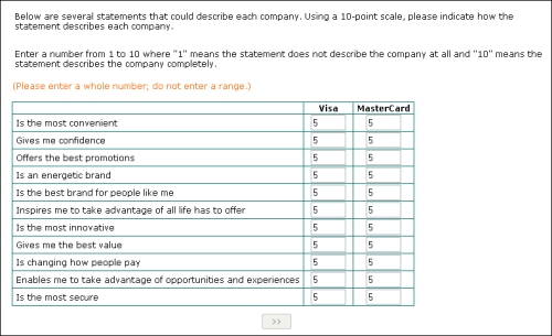
When I’m staring at a bad survey question — asking me to compare two absolutely identical companies in a matrix, for instance — my tendency is to do this:
straightline

They’re equal. There’s no difference between Visa and MasterCard in my mind. Discover and American Express, those are different, both from one another and from these two brands, but Visa and MasterCard might as well just merge, as far as I’m concerned. Of course, there’s no way to provide that answer in the framework provided here, so I decided to simply give each company a score of “5” for each item. That seemed to get the message across, as far as I was concerned. Of course, as soon as I clicked the button, I got booted, with the same generic non-qualified message you get when you tell them you don’t have kids or haven’t seen a movie in the past two months or whatever it is. We all know the truth: they booted me for straightlining.

Which I wasn’t.

At the very least, wouldn’t it be smarter to keep me in and see what the rest of my answers looked like? With the amount of amply-documented badly designed questionnaires out there, shouldn’t we maybe consider that a respondent will occasionally need to do something to get around a poorly framed question, or an item that simply doesn’t apply to them?

Simply ending the survey as soon as someone gives all items on a page the same value seems both too simplistic and too drastic a solution to me.

5 Comments

Filed under answer choices, bad user experiences, data quality, Greenfield, Market Research, matrixes make me cry, web research

Needs Moar Choices.

education

Seriously? Shouldn’t they also have broken out high school by year, or something? Maybe included a radio button for each individual year from kindergarten through law school? No, really, I just can’t imagine how such fine distinctions are useful to anyone. Is someone really looking at this and saying, “Wow, the 7 respondents with some advanced degree work are slightly more likely to say x than the 11 respondents who are currently in advanced degree work! Fascinating! Oh, wait, the margin of error is +/- 37.8%.”

I get that there’s value in collecting more, not less data; I’m a firm believer in asking respondents for their actual ages, actually, instead of for a range — because when you have the actual data, you can put it back together in whatever groupings you want, which may not be the groupings you think make sense before you see the results — but this here is just a mess.

Leave a comment

Filed under answer choices, bad user experiences, Market Research, The cancer that is killing market research, web research

Resident of What, Now?

Does anyone else have trouble answering this? I see it on nearly every Zogby Interactive poll I get, and I never know what to do with it:

zogby citizen

I just don’t get it.

Maybe I’m overthinking it — it happens — but I can’t figure out exactly what the underlying idea of the question is. I get why he asks if I have a passport, if I watch NASCAR, and how often I shop at Wal*Mart — it’s his “elites vs. normals” crosstabs, or whatever, and I assume this is supposed to be the same sort of thing, but I can’t figure it out.

Worse, I think the one choice I WOULD pick — that I think of myself as a resident of a particular region of the United States — isn’t listed.

Anyway, just wondering if anyone else is over-thinking this one and has trouble answering it as well.

2 Comments

Filed under answer choices, Market Research, web research, Zogby

Blank = Zero

Can we please just all agree that blank = zero?

Greenfield, unsurprisingly:

blankiszero

Come on, guys. Stop making things hard for respondents. It’s not like you have enough of them to begin with.

3 Comments

Filed under answer choices, bad user experiences, Market Research, the web is a visual medium, web research

Zogby Motorcycle Emptiness

What fresh hell is this? John Zogby has discovered the matrix? And somehow made it uglier than any other matrix in the history of research? All true, and more on that in a moment, but first, this unusual use of the ticky box:

zogby motorcycles

That’s probably illegible unless you click on it, but the gist is I’m being asked, in a pretty wordy fashion at that, which of the following things I’m interested in or knowledgeable about; nothing inherently wrong with that setup, except this: I’m then given exactly one box to check (or not check, as the case may be) : “motorcycles.”

Let’s type it out and count, OK?

John’s Way: (53 words)

“Now for some questions about consumer goods categories. Please choose the categories in which you feel you have a particular interest and knowledge. This means you actively seek out information on these products and services (for example you watch TV shows/read magazines and websites/attend exhibitions/discuss with friends and colleagues etc.)

My Way: (6 words)

“How interested are you in motorcycles?”

Now, it’s possible the reason I only saw the single checkbox for motorcycles is because my answers to the previous series of questions disqualified me from everything else, although I don’t really think my responses would have pointed in the direction of motorcycles,  but who am I to judge? Anyway, as promised, here’s what the first screen of these looked like:

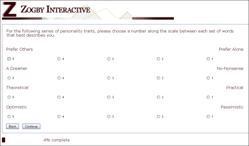
zogby matrix

Maybe I shouldn’t say this is uglier than any other matrix — maybe it’s just that it’s simpler, in that it uses less newfangled HTML and is therefore, I don’t know, easier to access via mobile browsers, which isn’t a bad design goal to have — it’s just very strange looking to me, and pretty hard to take in at a glance. By the time you get down to the last button on the right, it’s not immediately obvious to me if that “1” radio button is for “Pessimistic” or for some other word that I perhaps need to scroll down for, or that’s just not appearing for some reason.

Are mobile/degraded browsers a big factor in the panel research industry? Are there a lot of folks on the Greenfield panel using Netscape 2.0 on Mac IIci’s or something? Because I seriously don’t get why this hasn’t all been replaced — and I’m talking about everyone here, not just Zogby — with some well-designed Flash code. Seems to me a freshman design student could pretty quickly mock up something vastly superior to anything being used in the industry today, no?

One other thing I found interesting: on some (but not all) screens of this survey, when I clicked the final radio button, I was automatically advanced to the next page. Despite the pages having a “continue” button on them, by the way. I don’t have a problem with auto-advancing in general, though I think it needs to either consistently happen 100% of the time or 0% of the time — but I’m curious what y’all think about it. Is the auto-advance, which would make it difficult or impossible to go back and fix an error you made, a good thing or a bad thing?

8 Comments

Filed under answer choices, bad user experiences, Market Research, matrixes make me cry, the web is a visual medium, web research, Zogby

Is it me?

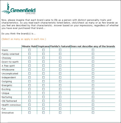
Is it just me, or do orange juice brand managers seem more likely than just about anyone else to think their brands have the ability to come to life with distinct human personality traits and characteristics? Is it just one crazy person who keeps using Greenfield for this? Is it the whole industry? Someone help me understand this.

This is at least the third time I’ve seen one of these:

another juice grid

(Also, “warm?” You really want me to think about whether or not any of these refrigerated products could best be described as being “warm?” Because, ew.)

ETA:

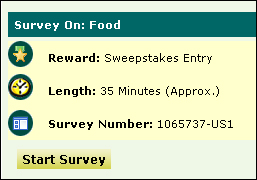
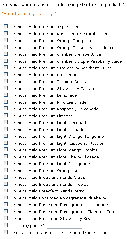
OH, COME ON. This is just ridiculous. I’m almost too fatigued looking at this to copy and paste it here, let alone fill it out. In fact, I think the only reason I’m continuing at all is so I can see what fresh horror awaits. How do they expect real people to answer things like this? Oh, right — because they promise us a sweepstakes entry in exchange for 35 minutes of our time. (No, really, they do:)

35 mins

Anyway, here’s what I’m yelling about now:

minute maid COME ON

6 Comments

Filed under answer choices, bad user experiences, Greenfield, incentives/compensation, Market Research, matrixes make me cry, web research

Best Buy Has Some Issues

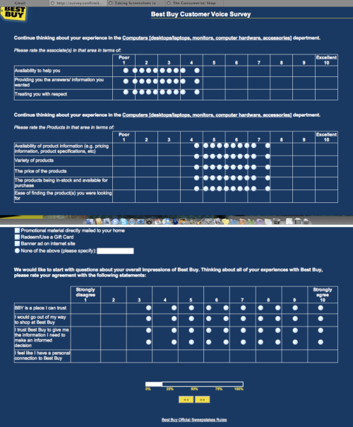
From this story at The Consumerist. I’m sure it’s just a browser rendering issue that would have been solved with more testing, but right now, it’s just one of my all time favorite matrixes:

bestbuylol

Well done, Best Buy!

1 Comment

Filed under a challenger appears, answer choices, bad user experiences, Market Research, matrixes make me cry, web research